Designer Reviews: 2025 Color of The Year
Every year, Pantone announces the Color of the Year, creating a buzz across the design world. For 2025, the chosen hue, Mocha Mousse, has sparked mixed reactions among designers. While it’s not love at first sight, it’s also not a complete miss.
At first glance, I was taken aback. I really expected the Color of the Year to be more daring. Given the recent trend of people embracing bold colors in interior design, I anticipated something like a dark purple or plum red. Instead, we have Mocha Mousse—a subdued brown with warm undertones. It’s safe, understated, and, as some critics might say, uninspiring.
I can see why this color is polarizing. It has its detractors—some might even say it looks unappealing at first. It only takes one 7-year-old to point out the fact that it looks like poop. However, when you approach it more maturely, you can see that the intention was to create a neutral that isn’t boring—a brown that feels versatile without being overwhelming. The more I look at it, the more I appreciate its subtle charm. In fact, it would make a great ’90s-inspired lipstick shade, which, as a fan of the ’90s aesthetic, I can get behind.
That said, for interiors, I’m still on the fence. While I can imagine it working beautifully in certain applications, I’d need to see it in action to decide if it truly resonates. Until then, I remain cautiously optimistic about Mocha Mousse and its potential to win over skeptics in the design world.
If you’re curious, read what I wrote about the 2024 Pantone Color: Designer Reviews the Colour of the Year, Hit or Miss?
Let’s take a look at interiors with mocha mousse vibes.
Mocha Mousse in Interiors


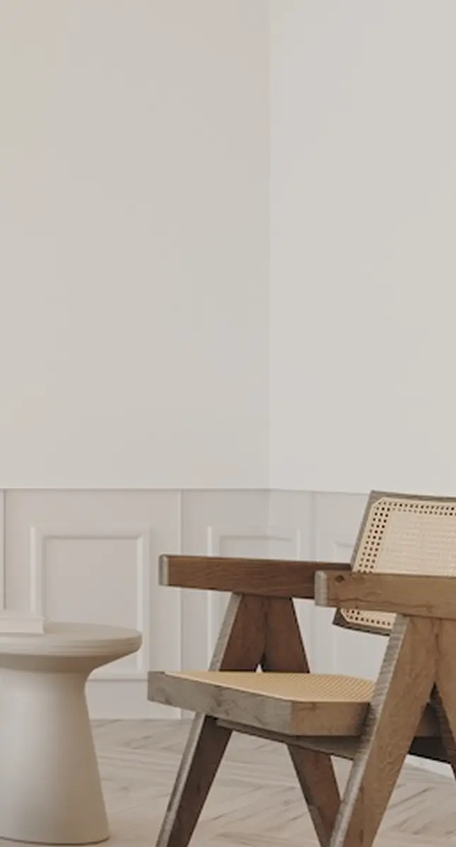
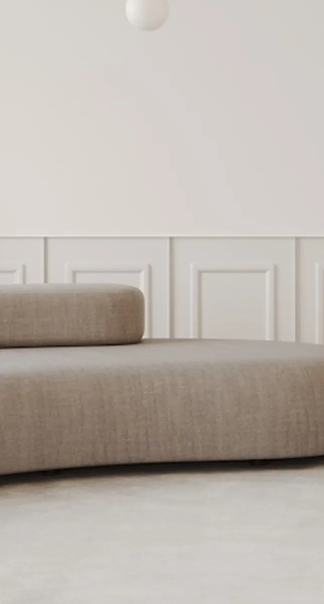
Okay, so now that I see this color in action, I’m not hating it at all. For some reason, it reminds me of early 2000s interiors—there’s something undeniably cozy about it. I can imagine many homeowners gravitating toward this shade and similar tones because it’s not overly bold yet still offers a warm, welcoming vibe.
Brown: A Color Rooted in Nature and Versatility
“For Pantone Color of the Year 2025, we look to a mellow brown hue whose inherent richness and sensorial and comforting warmth extends further into our desire for comfort, and the indulgence of simple pleasures that we can gift and share with others.”
Laurie Pressman
Vice President of the Pantone Color Institute
The color brown, often overlooked in favour of flashier hues, holds a unique place in design and culture. It embodies warmth, stability, and grounding—qualities deeply tied to the natural world. From the rich tones of freshly tilled soil to the comforting shades of aged wood, brown connects us to the earth and a sense of timelessness.
Brown is omnipresent in nature. It represents the sturdiness of tree trunks, the fertility of soil, and the muted tones of dried grasses and sand. This ubiquity translates into its psychological impact—brown is often associated with dependability, resilience, and security. It’s a color that invites relaxation and comfort, evoking the cozy feelings of sitting by a crackling fire or sipping a warm cup of coffee.
Brown in Interior Design
In the world of interiors, brown has long been a foundational color. Its versatility allows it to act as a neutral backdrop or a prominent feature, depending on how it’s used. Deep chocolate browns convey richness and sophistication, often associated with traditional styles, while lighter shades like taupe and mocha create calming and inviting spaces.
When paired with complementary tones, brown becomes dynamic. It harmonizes beautifully with greens and blues for a nature-inspired palette, works with creams and whites for a clean, classic look, and can even be contrasted with metallics like gold or brass to exude luxury.
Final Thoughts on Mocha Mousse
Personally, I love anything brown—chocolate, brown eyes, brown hair, brown fashion—you name it, I’m all in. So, when it comes to interiors, my sentiment is exactly the same. Brown is beautifully rich, sensual, and effortlessly sophisticated. It has a warmth and depth that makes spaces feel grounded yet inviting. And you know I’m all about creating a sensual interior that oozes comfort and elegance. Read Sensual Spaces: How to Create a Sexy Interior.
Side note, can all us English speakers agree on one way to spell colour/color?!!
Click Here To Shop My Favourite Home Goods
Let’s design your space together, virtually.