The Best Paint Colors for Your Sitting Room
Choosing the right paint colors for your sitting room can completely change how the space feels.
Choosing the right paint color important; it can dictate how the room feels.
If you’re staring at dozens of paint swatches and wondering where to start, I recommend thinking about the vibe of the room first.
Do you want your sitting room to feel cozy? Sophisticated? Organic? Bright? Moody?
Once you know how you want the room to feel, narrowing down the perfect paint color becomes much easier.
Here are some of my favourite paint colors for sitting rooms, organized by the mood you want to create.
AVOID COSTLY (AND UGLY) DESIGN MISTAKES
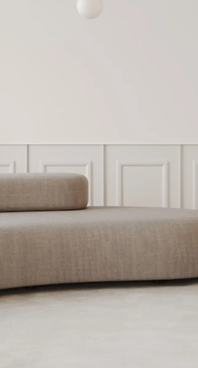
If You Want a Light and Airy Sitting Room
Light and Bright Sitting Room Paint Colors
If your goal is to make your sitting room feel brighter and more open, your first instinct might be to paint everything pure white.
But pure white isn’t always the best choice.
In many homes, a slightly warmer off-white creates a softer and more inviting look while still reflecting plenty of light.
Benjamin Moore Oxford White
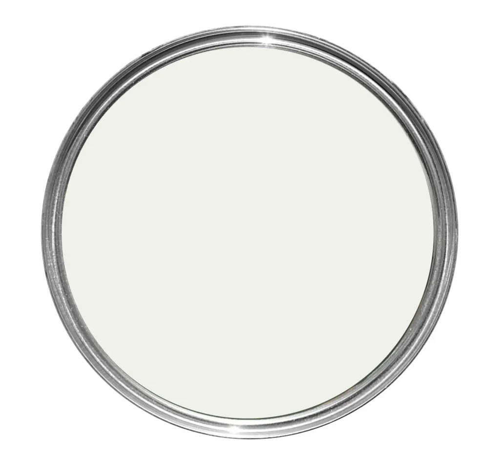
Oxford White is my go-to white.
Compared with warmer whites, it feels slightly cleaner and fresher while still being relatively easy to use.
I particularly like it in rooms where the furniture, rugs or artwork provide most of the color.
The walls essentially become a quiet backdrop rather than competing for attention.
Farrow & Ball Old White
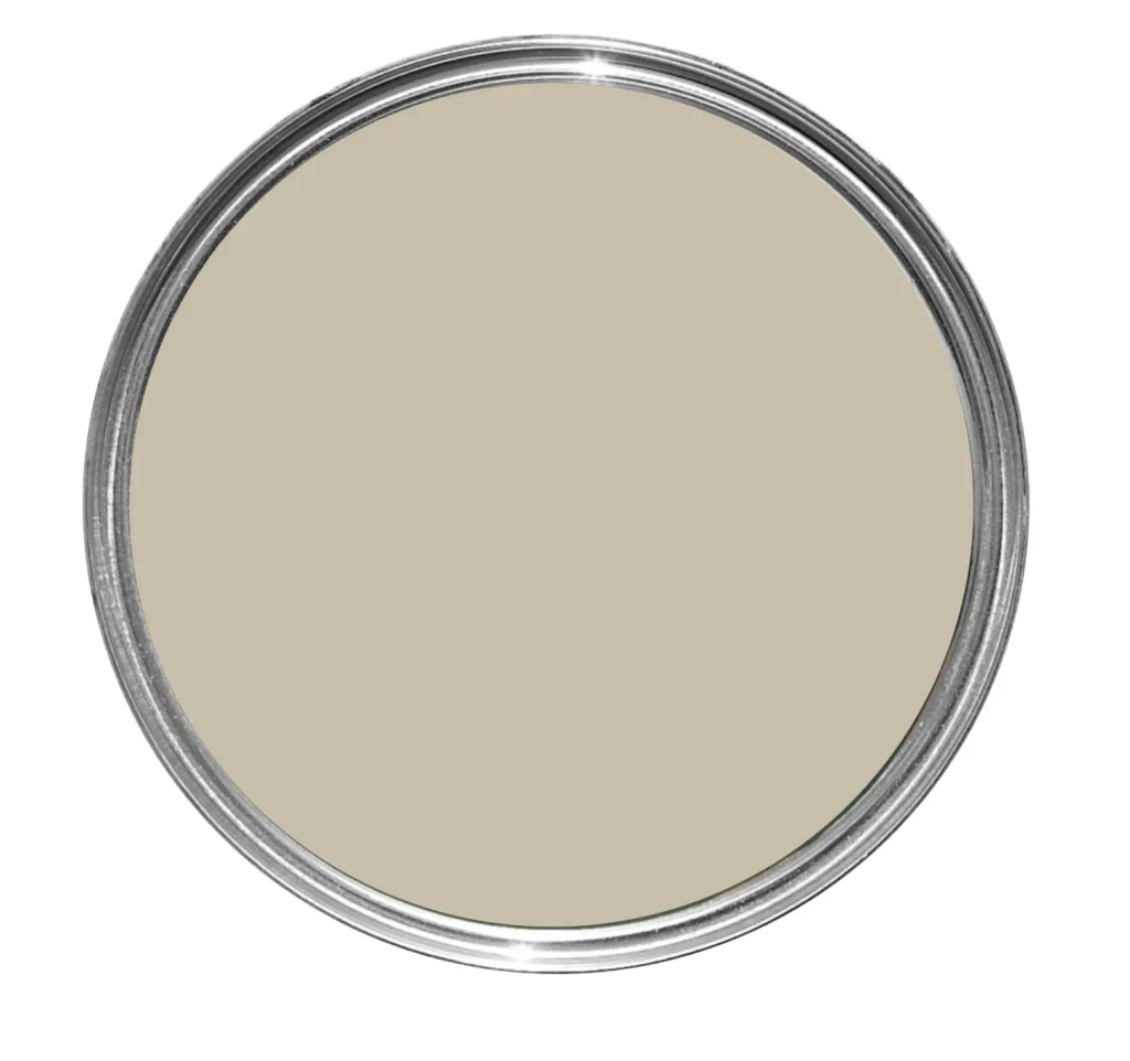
If old money was a paint color, it would be Farrow & Ball Old White.
This color looks a lot deeper swatched than it does in a real space.
It’s particularly beautiful in spaces with lots of natural textures, warm flooring and wood furniture.
This color gives a sitting room a little more warmth while still keeping the overall space bright.
Benjamin Moore Classic Gray
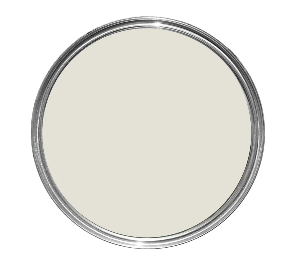
Classic Gray is a stunning off-white (not sure why it is named gray).
It works well in traditional, transitional, Scandinavian and contemporary interiors because it is soft without reading overly yellow.
If you want white walls but are worried about the room feeling sterile, Classic Gray is a very safe starting point.
If You Want a Cozy and Moody Sitting Room
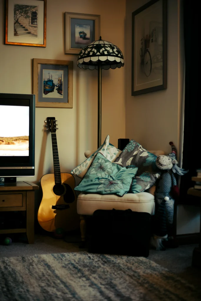
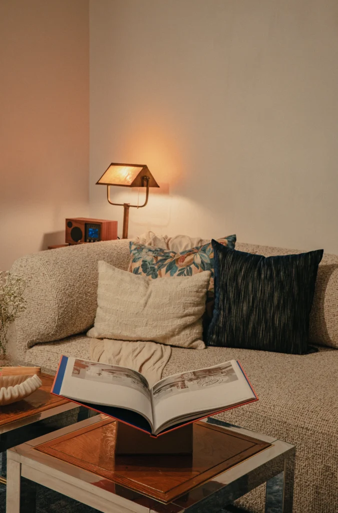
Cozy and Moody Sitting Room Paint Colors
A cozy sitting room should feel warm, comfortable and inviting — the kind of space you actually want to curl up in at the end of the day.
For this look, I typically gravitate toward colors with warm undertones rather than crisp whites or cool grays.
Sherwin-Williams Accessible Beige
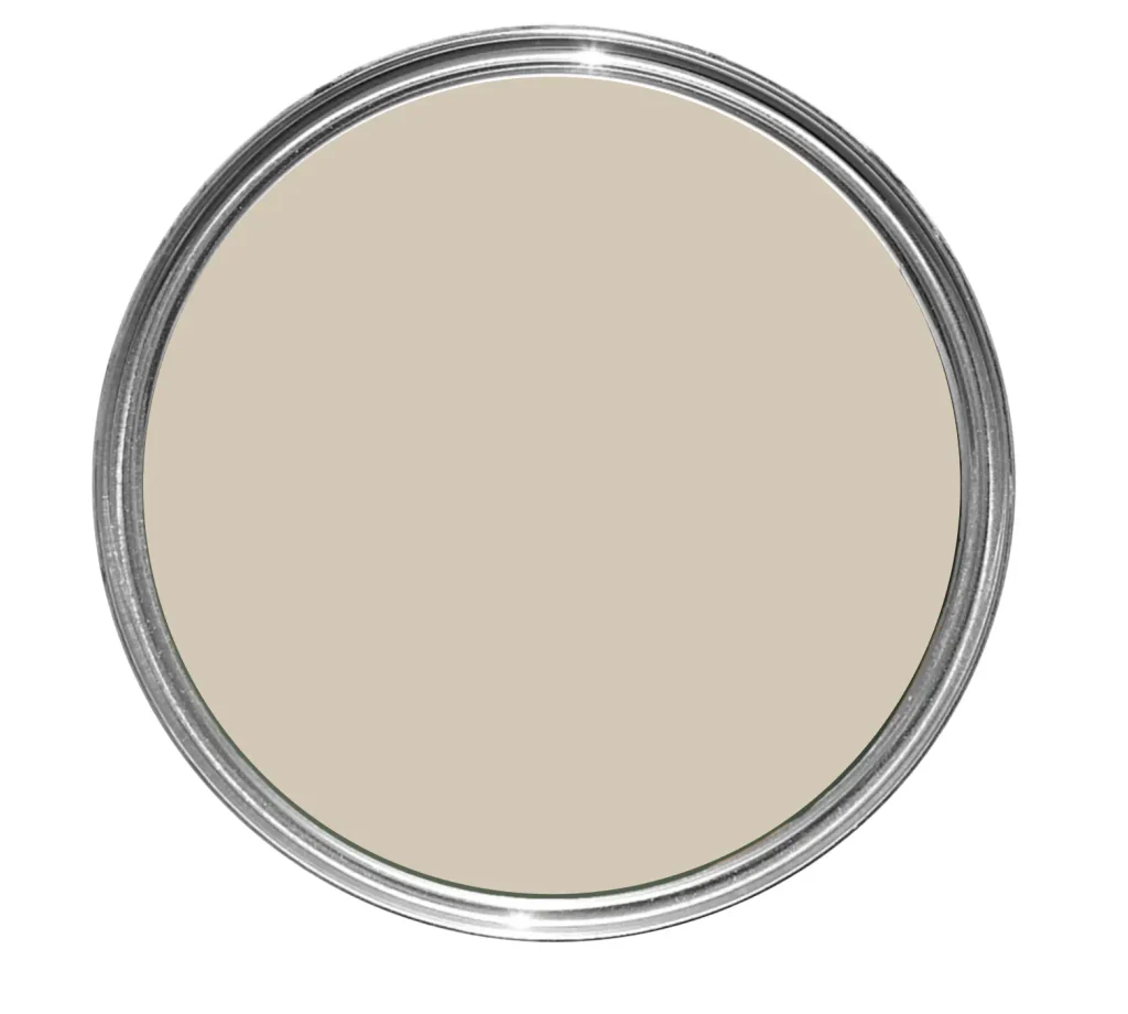
Accessible Beige is one of my favourite alternatives to traditional gray, and it is my most-used paint color, and as a designer, that says a lot!
It has a warm, earthy undertone that makes a sitting room feel comfortable and lived-in without making the walls feel overly beige.
It looks especially beautiful paired with warm whites, oak, walnut, caramel leather and textured neutral fabrics.
If you’re looking for a cozy neutral that still feels relatively modern, this is a great one to test.
Benjamin Moore Inukshuk
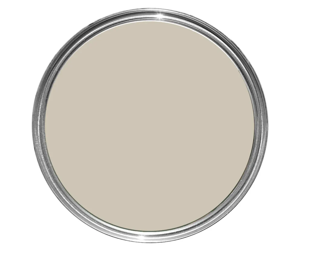
For something slightly deeper, Inukshuk creates a beautifully warm and sophisticated backdrop.
It sits somewhere between beige, taupe and gray and works incredibly well in rooms where you want a little more depth.
Pair it with off-white trim, warm wood and layered textiles for a relaxed, elevated sitting room.
Farrow & Ball Drop Cloth
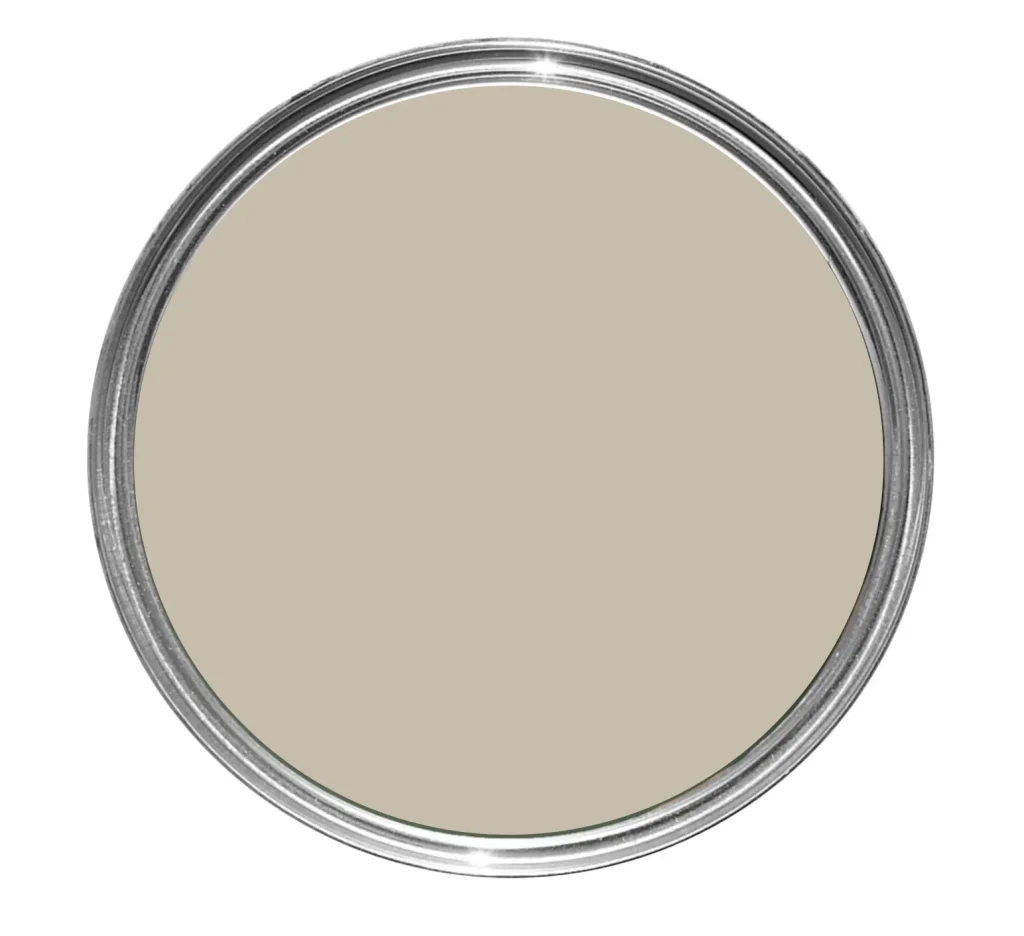
Drop Cloth is a moody paint color with richness without becoming too dark or overpowering.
It works particularly well with natural wood, cream upholstery, warm metals and traditional or transitional interiors.
If your room doesn’t get a ton of natural light, however, make sure you test it first. Like most greiges, it can look slightly darker depending on the exposure of the room.
If You Want an Earthy Sitting Room
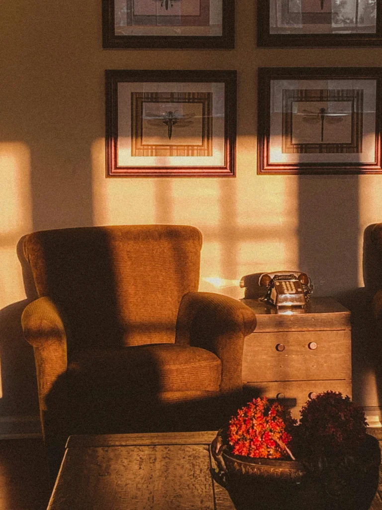
Earthy Sitting Room Paint Colors
Earthy interiors continue to be one of my favorite directions because they feel timeless rather than trendy.
Think muted greens, warm browns, clay tones and colors inspired by nature.
These shades pair especially well with wood furniture, stone, linen, wool and other natural materials.
Benjamin Moore October Mist
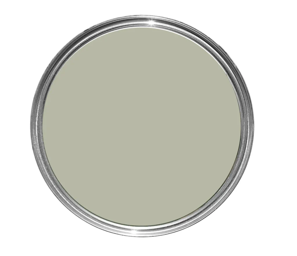
October Mist is a soft, muted green that feels calm without becoming too pastel.
It works particularly well in sitting rooms with warm woods and creamy neutrals.
Green is also one of those colors that can act almost like a neutral when you choose the right shade.
Instead of fighting with the other elements in the room, it creates a subtle backdrop for furniture, art and accessories.
Sherwin-Williams Dried Thyme
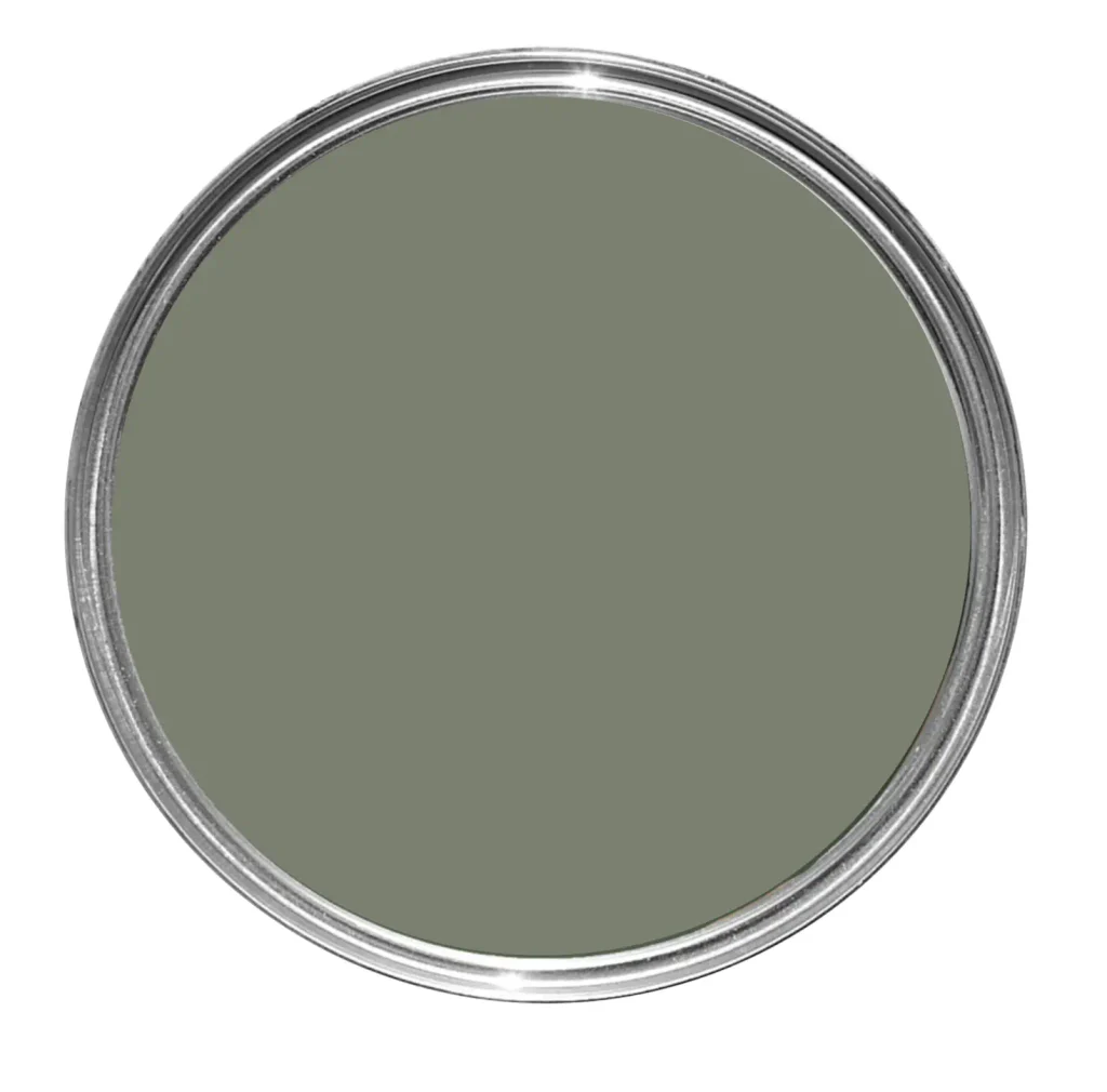
If you want something deeper and slightly moodier, Dried Thyme is worth considering.
This green shade feels natural and sophisticated.
I particularly like it for sitting rooms with vintage furniture, darker woods, warm metals or earthy textiles.
Farrow & Ball Pantalon
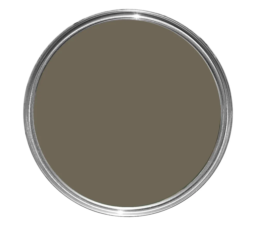
Pantalon is another stunning brown earthy green, on the deeper side (don’t be afraid of dark paint).
Farrow & Ball describes it as neither brown nor green; the mysterious tone of Pantalon changes in different light conditions.
If You Want a Sophisticated Sitting Room
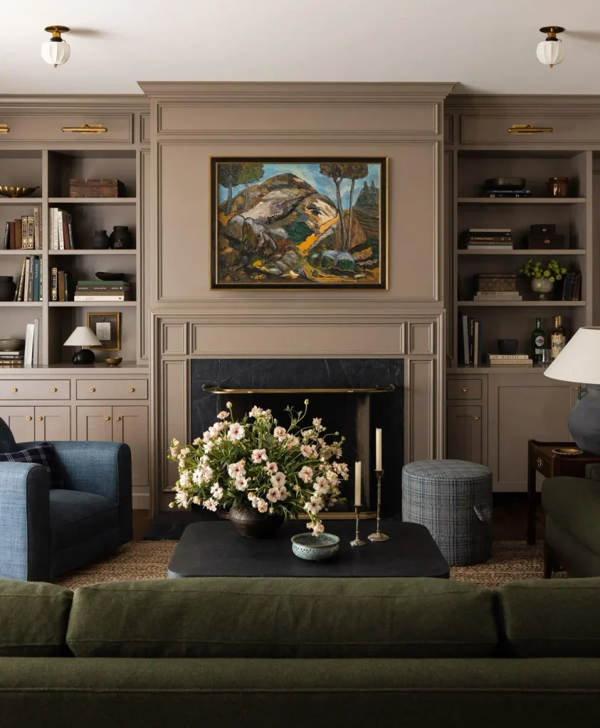
Sophisticated Sitting Room Paint Colors
For a more polished or elevated sitting room, I usually look for colors that have a little complexity to them.
Rather than choosing a very obvious blue, green or gray, look for shades with muted undertones.
These colors tend to change subtly throughout the day depending on the lighting.
Benjamin Moore Chelsea Gray
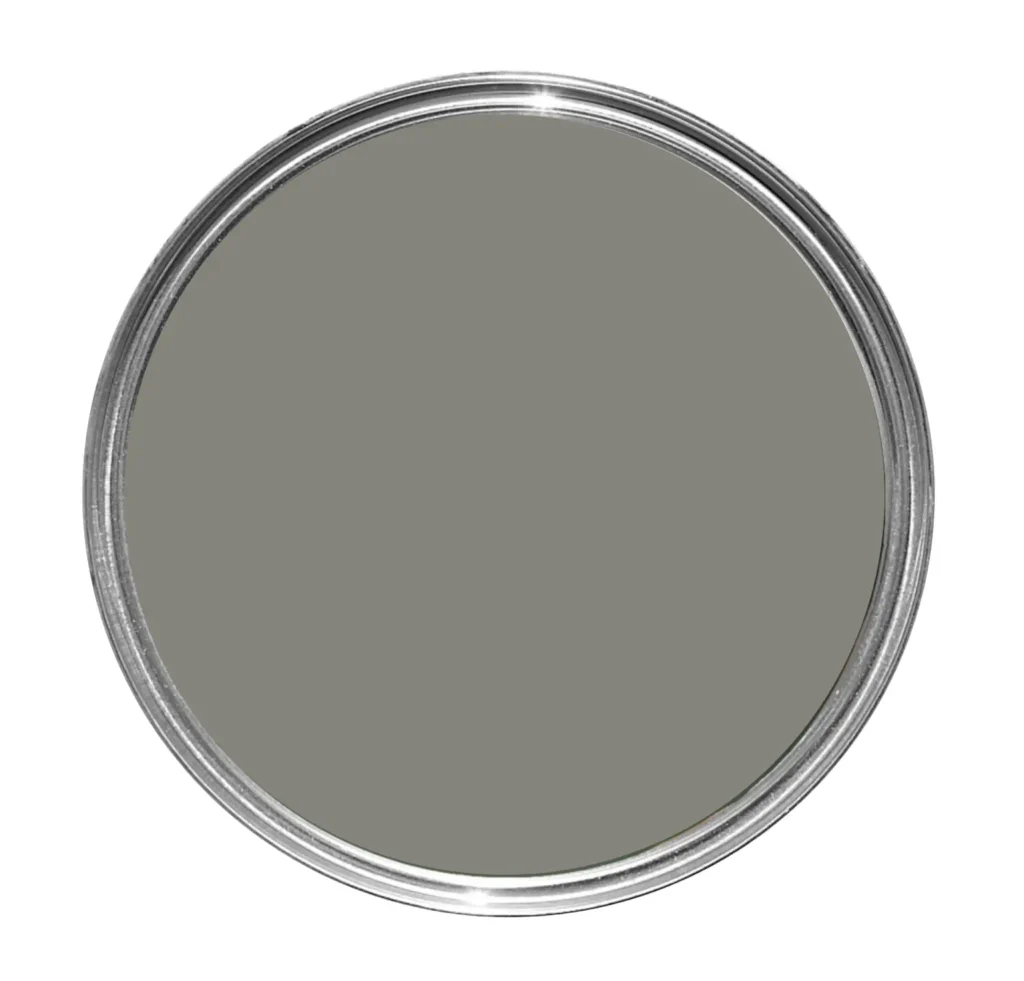
Chelsea Gray is a deeper mid-tone gray with a sophisticated, slightly warm appearance.
It works beautifully with crisp trim, dark wood and statement artwork.
It’s also a great option if you want more contrast than a light greige without committing to charcoal.
Farrow & Ball Pigeon
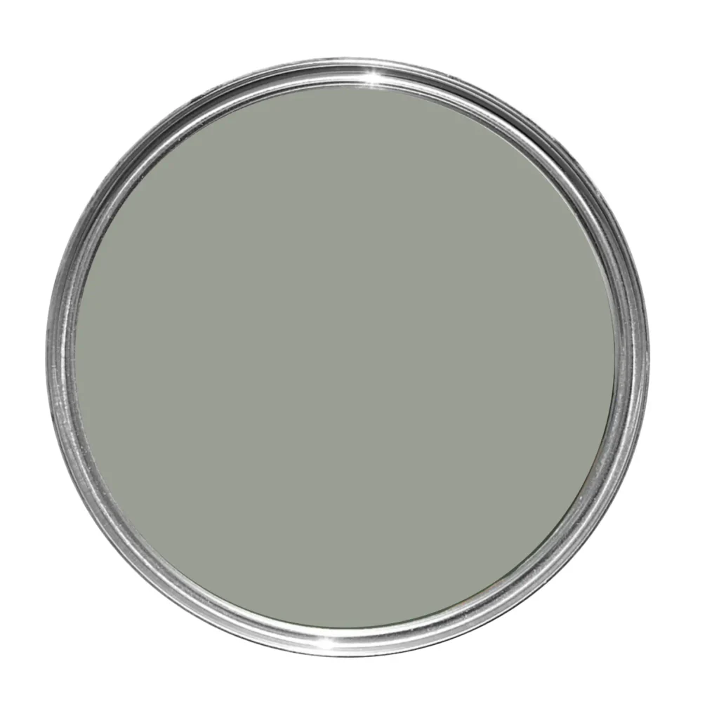
Pigeon is a muted blue-green-gray that has a very understated look.
It works beautifully in traditional interiors but can feel equally at home in more contemporary spaces when paired with simple furniture.
Benjamin Moore Knoxville Gray
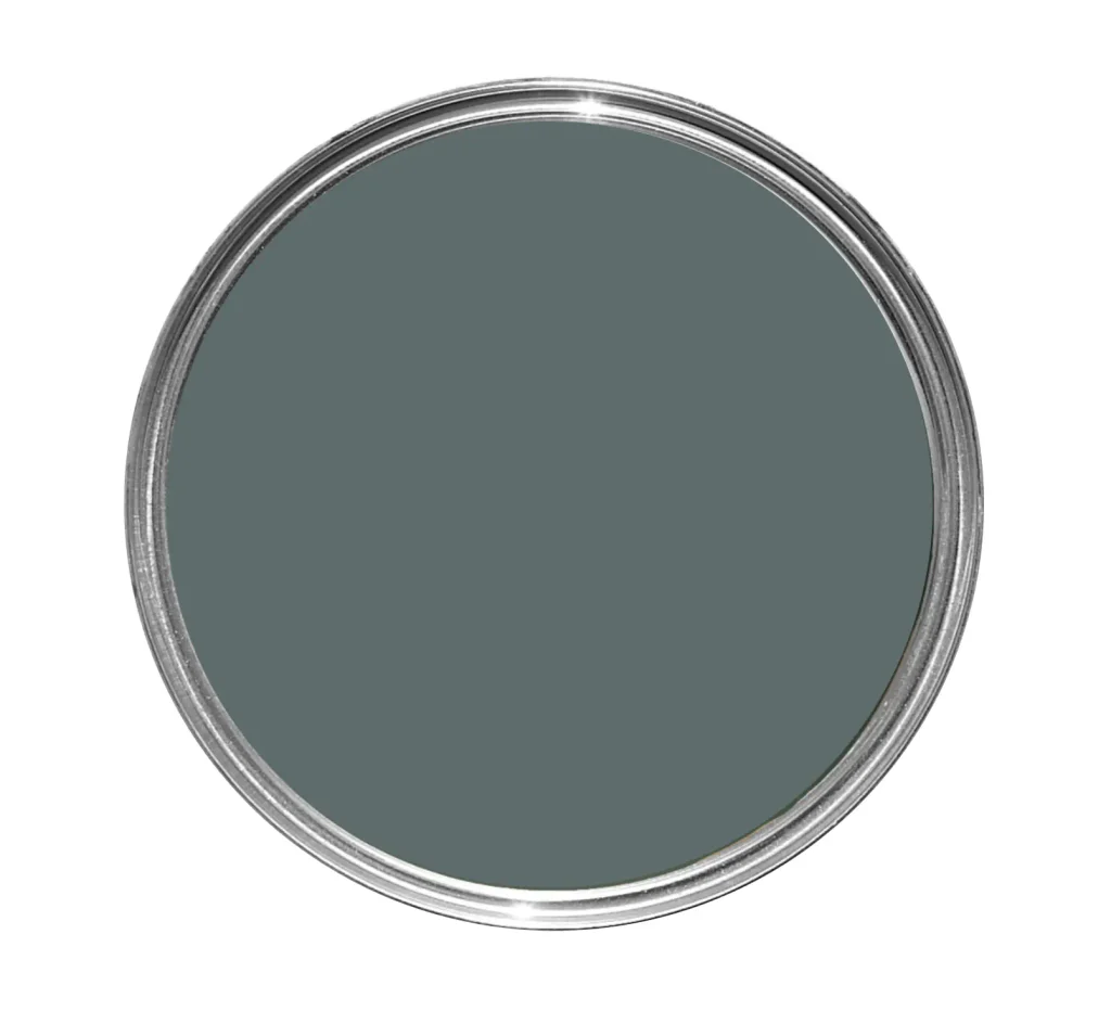
Knoxville Gray is a sophisticated blue-green-gray that works beautifully in sitting rooms.
It’s darker than many neutral paints but isn’t as intense as a true navy.
Pair it with warm brass, cognac leather or creamy upholstery for a layered, elegant look.
If You Want a Bold and Dramatic Sitting Room
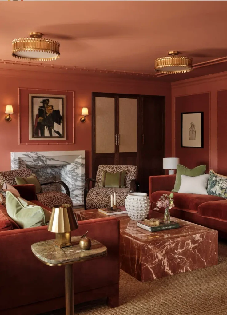
Bold Sitting Room Paint Colors
A sitting room doesn’t always have to be neutral.
If the rest of your home is relatively quiet, this can actually be a great room to introduce more personality.
You could experiment with burgundy, plum, deep blue or even a burnt orange depending on the rest of your palette.
Benjamin Moore New London Burgundy
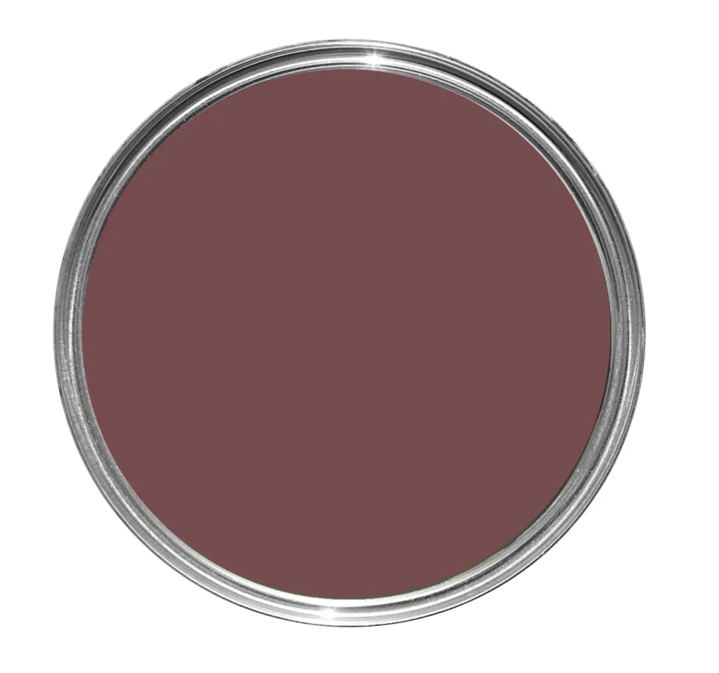
A deep burgundy, such as New London Burgundy, can make a sitting room feel incredibly warm and sophisticated.
Rather than painting one random accent wall, I prefer seeing rich colors like this used intentionally throughout the room.
You could even carry the same color onto built-ins or millwork for a more enveloping look.
Benjamin Moore Blue Note
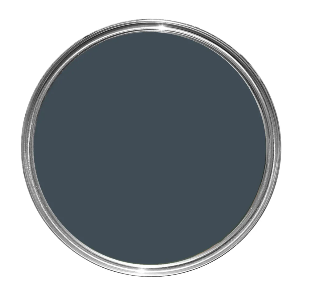
Blue Note is a deep navy with a slightly muted appearance; this is what I call a sexy color.
It adds drama without feeling overly bright or nautical.
It works especially well with brown leather, walnut, warm metal and vintage rugs.
Farrow & Ball Pelt
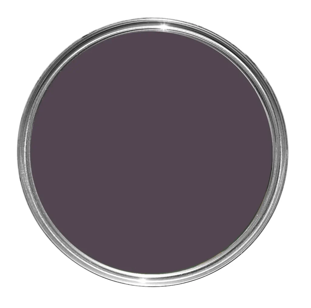
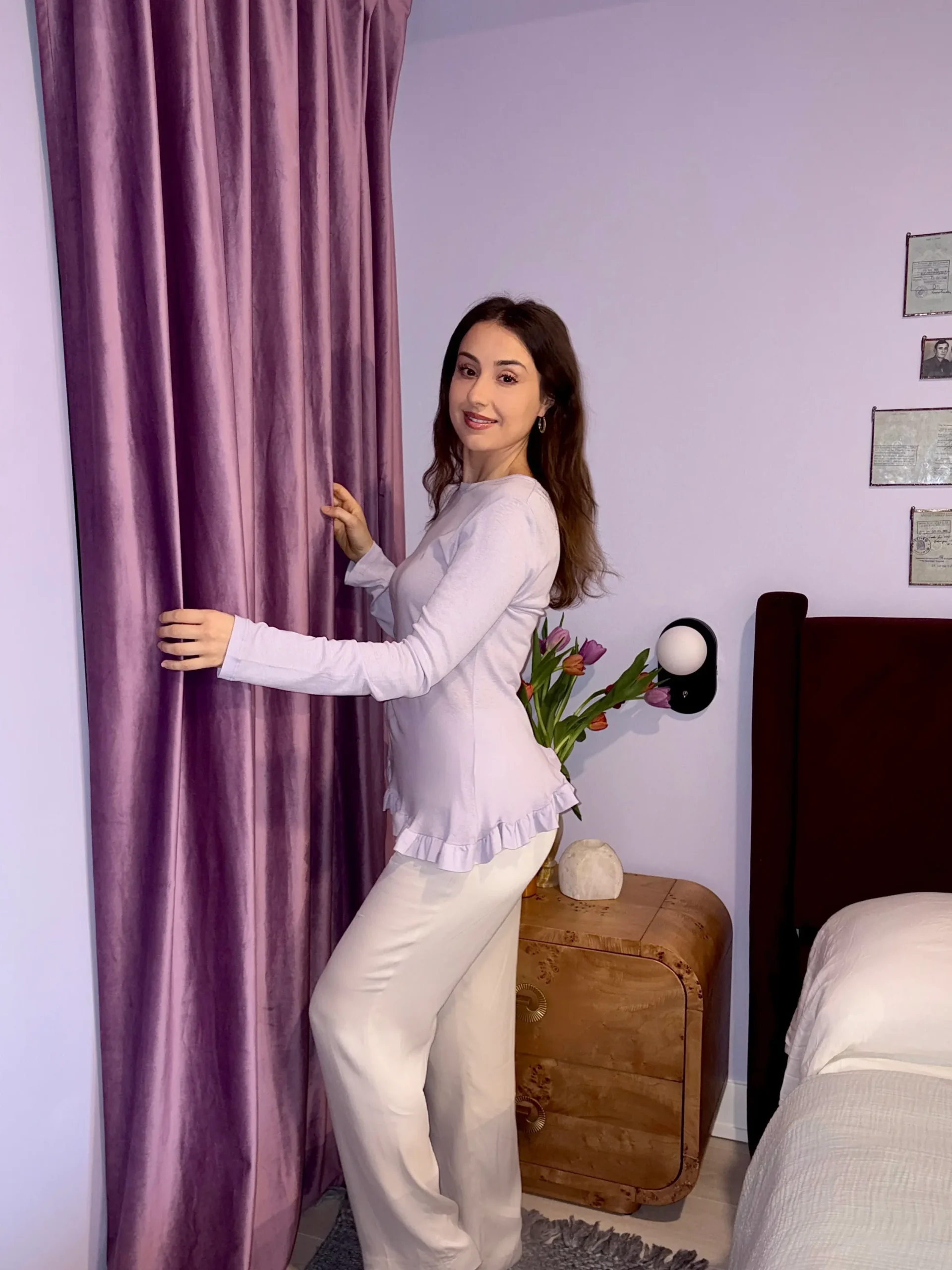
For something unexpected, a deep plum or aubergine, such as F&B Pelt can be incredibly beautiful in a sitting room.
Purple tends to be underused in interiors, but deeper shades can feel rich, sophisticated and surprisingly timeless when paired with warm neutrals and wood.
How to Choose the Right Paint Color for Your Sitting Room
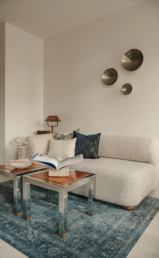
Finding a paint color you love online is only the first step.
The exact same paint color can look completely different from one sitting room to another because of natural light, artificial lighting, flooring and furniture.
Before committing to a color, there are a few things I always recommend considering.
Look at Your Natural Light
A north-facing sitting room typically receives cooler light, which can make certain gray and blue paints appear even cooler.
South-facing rooms tend to have warmer natural light, so they can usually handle cooler paint colors more easily.
Your paint color will also change throughout the day.
This is why I never recommend choosing a color based solely on a photo online or a tiny paint chip.
Consider Your Flooring
Your flooring is one of the largest surfaces in the room and plays a huge role in how your wall color will read.
Warm oak flooring will interact differently with a paint color than cool gray flooring or dark walnut.
Try to identify whether your floors have warm, cool or neutral undertones before selecting your wall color.
Look at Your Furniture
If you already own your sofa, rug and main pieces of furniture, let those guide your paint selection.
It is much easier to choose a paint color that complements an existing sofa than it is to find a new sofa that perfectly matches a paint color you selected first.
Test Your Paint Samples
Always test your paint color directly in the room.
You can paint large sample boards or use peel-and-stick samples from Samplize and move them around the space.
Look at the color during the morning, afternoon and evening.
A paint color that looks beautiful at noon may suddenly look completely different once your lamps are turned on at night.
Should Your Sitting Room Be the Same Color as the Rest of Your Home?
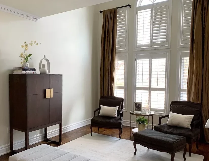
Not necessarily.
There is a tendency to think that every room in an open or connected home needs to use the exact same neutral.
It doesn’t.
Your home should feel cohesive, but cohesive does not mean identical.
One way to create consistency is to repeat undertones or colors throughout the home.
For example, you might use a warm off-white in your hallway and then transition into a muted green sitting room.
The spaces will still feel connected because the colors share similar warm undertones.
The goal is to create a palette that flows from room to room rather than using one paint color everywhere.
What Is the Best Sitting Room Paint Color?
The best paint color for your sitting room is the one that works with your home’s lighting, flooring, furniture and — most importantly — the atmosphere you want the room to have.
If you want a warm and cozy sitting room, start with warm greige, taupe or beige.
If you want something earthy, try a muted sage or olive green.
For a light and airy space, consider a softer off-white rather than a stark white.
And if you want a room with more personality, don’t be afraid to explore deep green, navy, burgundy or plum.
My biggest advice is to stop asking, “What color is popular?” and instead ask, “How do I want this room to feel?”
Once you’ve answered that question, choosing the right paint color becomes a lot easier.
Click Here To Shop My Favourite Home Goods
Let’s design your space together, virtually.