The Best Living Room Paint Color Combinations
Choosing a living room paint color and creating a harmonious color combination can be a challenge. There’s much to consider when putting together a cohesive color palette, including the character and architecture of the home, your personal interior design style, and how the colors will work with the existing elements in the space.
In this guide, I’ll break down some of my favourite paint color combinations for living rooms, with recommendations based on your flooring undertones and overall design intent. Whether you’re looking to create a warm and inviting space, a soft and sophisticated living room, or something with a little more contrast, these combinations will help you choose colors that work beautifully together.
AVOID COSTLY (AND UGLY) DESIGN MISTAKES
Living Room Paint Color Guide
Paint Colors For Living Rooms with Dark Brown Floors
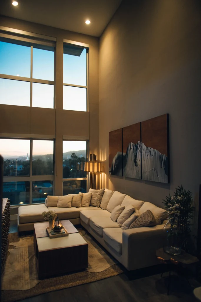
If you have rich, dark brown floors in your living room, you already have a beautiful foundation for creating a warm, earthy palette. Rather than fighting against the depth of the flooring, I recommend leaning into its warmth and using paint and accent colors that complement the richness of the wood.
For the main wall color, consider a warm beige or greige with subtle earthy undertones. A shade such as Sherwin-Williams Accessible Beige or Benjamin Moore Revere Pewter is a great foolproof option, as it brings warmth to the space without feeling overly yellow or dated. The softer neutral also helps balance the visual weight of darker floors, keeping the room feeling inviting and open.
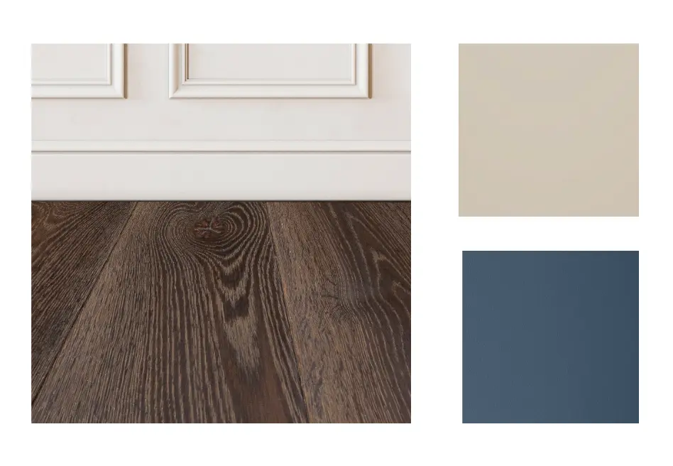
When it comes to accent colors, consider shades that naturally work alongside brown, such as navy blue, sage green, muted olive, or even a warm terracotta. Navy, such as Benjamin Moore Van Deusen Blue can introduce a little more contrast and sophistication, while sage and olive create a softer, more organic feel.
You can bring these accent colors in through furniture, artwork, area rugs, window treatments, cushions, or smaller decorative pieces rather than committing to another wall color.
Together, this combination creates a harmonious, grounded palette that works with the dark wood flooring rather than competing with it. The result is a living room that feels warm, layered, and connected to the natural tones already present in the space.
Paint Colors For Living Rooms with Red Tone Floors
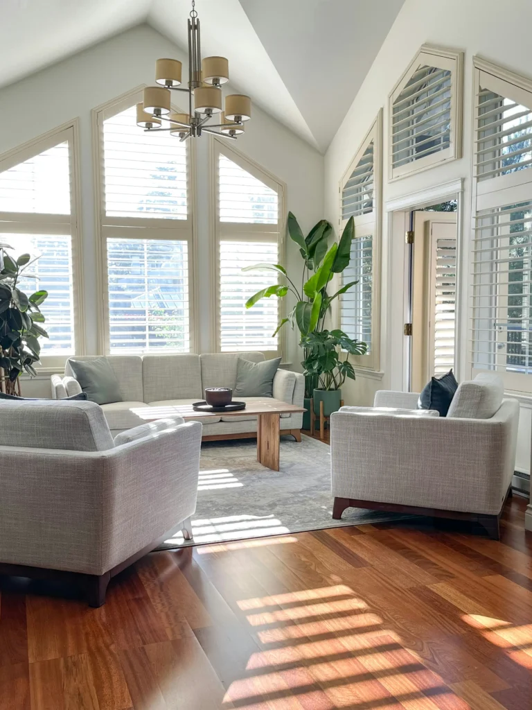
When it comes to living rooms with red-toned flooring, including orange or reddish-brown wood floors, it’s important to consider whether you want to enhance those warm undertones or help soften them. Because these floors can read as quite saturated, the colors you introduce on the walls and through furnishings can have a noticeable impact on how strong those red and orange tones feel.
If You Want To Enhance the Warmth
If you actually like the red undertones in your flooring and want to make them feel more intentional, consider introducing cooler complementary colors. Powder blue, such as Sherwin-Williams Hinting Blue, or a soft blue-gray, and sage green can work particularly well. These colors create contrast against the warmth of the flooring, making the wood tones feel richer and more vibrant without necessarily making the entire room feel overly warm.
For example, a soft sage green can create a beautiful connection between the warm flooring and natural elements such as wood, plants, linen, and woven textures. A powder blue, on the other hand, creates a little more contrast and can give the room a fresher, lighter feel.
If You Want to Tone Down the Red
If the red or orange undertones in your floors feel a little too prominent, I would take a more neutral approach. Mid-tone beige and warm neutral colors can help soften the overall appearance of the flooring without creating a stark contrast.
Some shades to consider include Sherwin-Williams Moderate White or Sherwin-Williams Porcelain, both of which can provide a softer backdrop that allows the flooring to feel less dominant. The key is to avoid choosing a beige that is too warm or yellow, as this can actually emphasize the orange and red undertones rather than neutralizing them.
Choosing Your Accent Colours
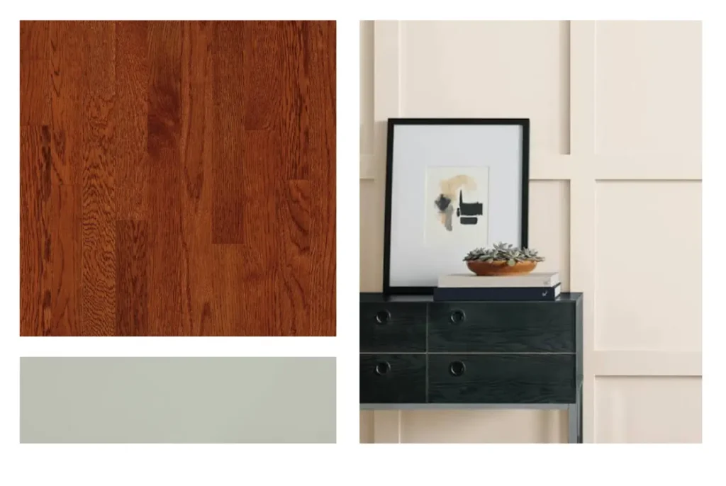
The same principle applies when selecting your accent colors. If your goal is to intensify the warmth of the floors, a muted green such as Sherwin-Williams Contented can create an attractive contrast that makes the reddish tones feel more saturated and intentional.
For a more sophisticated and subdued look, consider introducing a dusty blue-gray, such as Sherwin-Williams Cadet. The cooler undertones help balance the warmth of the flooring while giving the room a more layered and refined colour palette.
Paint Colors For Living Rooms with Light Floors
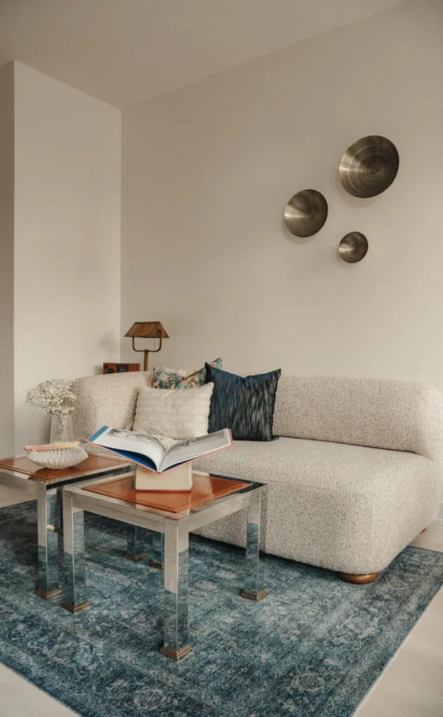
View more of this project, here.
When it comes to light-colored flooring, you have a lot of flexibility when developing your living room colour palette. Materials such as light oak, pale wood, blonde flooring, and light-toned stone tend to work particularly well with contemporary colour schemes. I often like to pair these lighter floors with cooler, understated tones and intentional pops of warmth to keep the room feeling fresh and modern without allowing it to fall flat.
One of my go-to paint colours for this look is Benjamin Moore Oxford White, which is one of my all-time favourite whites. It gives you that beautiful crisp, white-wall appearance while still feeling considered and finished. It’s a great option when you want the walls to feel light and clean without the room looking as though something is missing.
Light gray, such as Benjamin Moore Paper White is another great option to consider. A soft, well-balanced gray can blend seamlessly with light flooring and act as a quiet backdrop, allowing other elements in the living room—such as furniture, artwork, lighting, and accessories—to take centre stage.
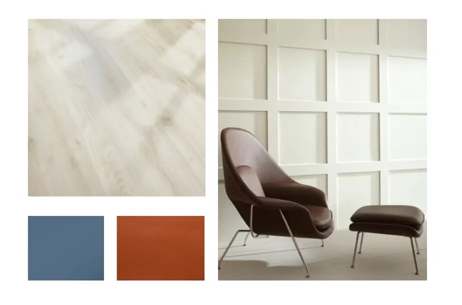
accent with bold colors
When working with light floors, I often think of them as a blank canvas. Because they don’t necessarily dictate a strong colour direction, you have more freedom to introduce color through your furnishings and accessories.
Personally, I love introducing pops of blue and orange into spaces with light floors. The blue adds a cooler, calming element, while orange brings warmth and energy into the room. You don’t necessarily need to introduce these colours through paint, either. In the living room pictured above, I brought the color palette in through the area rug, accessories, and smaller decorative elements, allowing the colors to be layered throughout the room without becoming overwhelming.
Paint Colors For Living Rooms with Grey Floors
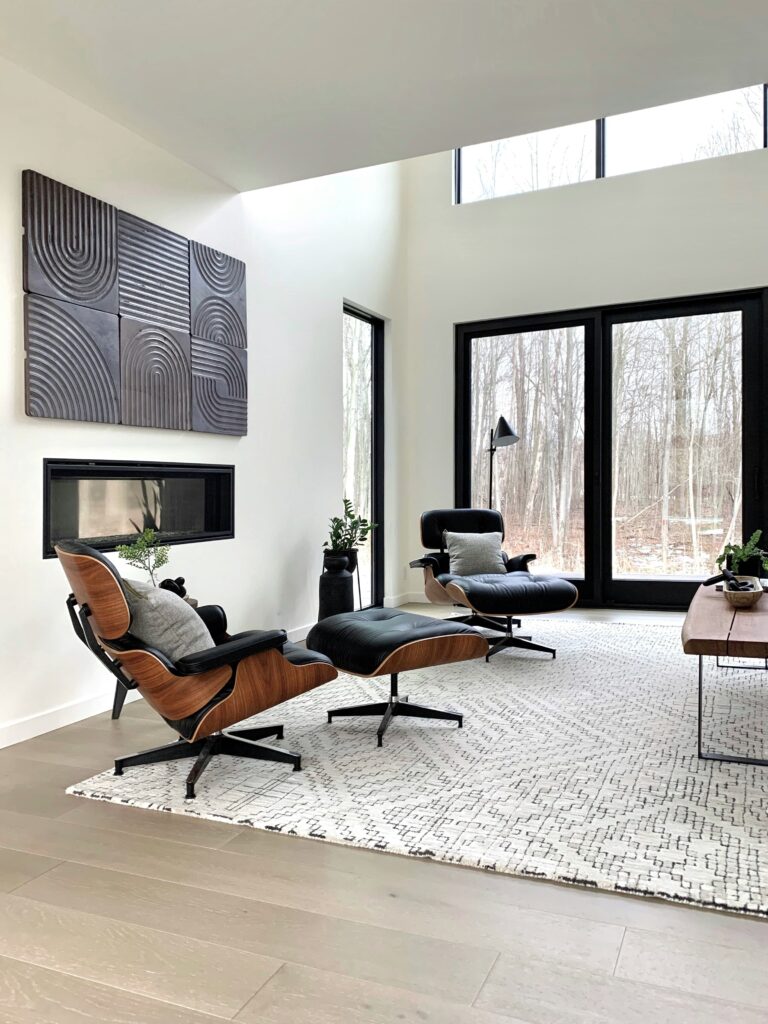
If your living room has gray-toned flooring—hopefully a choice you haven’t come to regret after the circa-2008 gray craze!—selecting the right paint colour really comes down to understanding the specific undertones in your flooring. Gray is not simply gray; it exists on a spectrum and can lean warm, cool, blue, green, or even slightly beige depending on the material and lighting.
warm grey
If your flooring is a warmer gray, what I like to call a mushroom brown, I recommend staying within a warmer colour palette. Warm beige and greige shades can help soften the gray and create a more cohesive, inviting space. Sherwin-Williams Aesthetic White is one option worth considering, as its warm undertones can work nicely alongside warmer gray flooring without creating a stark contrast.
cool grey
On the other hand, if your flooring is a cooler gray, I would generally recommend staying within a cooler colour family for your walls, such as, Sherwin-Williams Winsome Grey. Soft cool grays, blue-grays, and other muted cool neutrals can help the flooring feel intentional and prevent the different undertones from competing with one another. Pairing a very warm beige with a distinctly cool gray floor, for example, can sometimes create an uncomfortable disconnect between the two surfaces.
This is why testing your paint colours is particularly important when working with gray flooring. Look at your samples at different times of day and alongside the flooring itself. Natural light, artificial lighting, and surrounding finishes can all influence how the undertones appear, so a color that looks neutral on a paint chip may suddenly reveal blue, green, or purple undertones once it’s in your space.
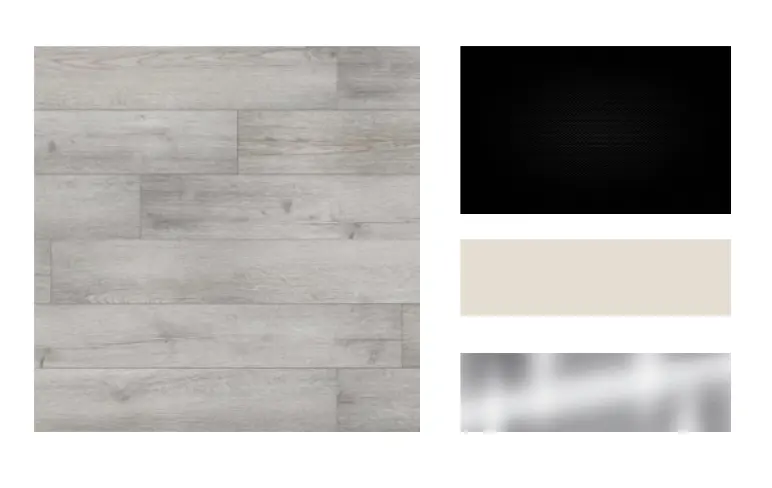
When it comes to accent colours, the good news is that gray is incredibly versatile. Black accents and metal finishes—particularly black, brushed brass, chrome, or softer aged metals—can look fantastic against gray flooring and help give the space more definition. And because gray is essentially a neutral, you have plenty of freedom when it comes to introducing colour.
Click Here To Shop My Favourite Home Goods
Let’s design your space together, virtually.