How To Choose a Paint Color: Designer’s Guide
Selecting a paint color can be intimidating. With thousands of shades across multiple paint brands—not to mention the time and cost involved in painting—you want to be confident you’re choosing the right one.
AVOID COSTLY (AND UGLY) DESIGN MISTAKES

As a designer, I’ve selected paint colors for countless homes throughout my career. Over time, I’ve developed a system that’s been refined again and again into what I’d confidently call a foolproof approach to choosing paint colors. So, if you’re thinking about repainting, this is worth reading first.
Step 1: Identify What’s Staying + the Feeling You Want to Achieve
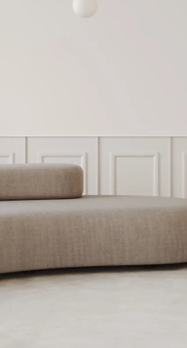
When repainting a space, I always choose a color based on what already exists in the room. That means the first step is identifying what’s staying and what’s going. Are you starting from scratch, or is the space already furnished and you’re simply updating the paint? This will determine how you approach your color selection.
Next, think about the feeling you want to create. Are you aiming for something cozy and warm, or bright and airy? Do you want to introduce color, or are you leaning toward neutrals and off-whites?
In short, you want to clearly define two things: the mood you’re trying to achieve and the elements that will remain in the space. These will guide every paint decision moving forward.
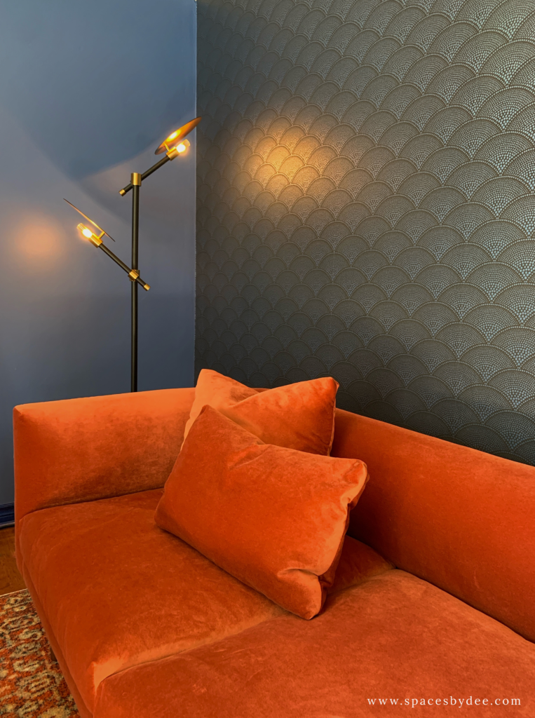
Step 2: Create a Color Combination
Once you’ve identified what’s staying in the space and the overall feeling you want to achieve, the next step is to build your color combination.
If you’re more visual (and find color pairing overwhelming), start by gathering inspiration. A great place to begin is Pinterest—search for spaces that have similar features to yours and reflect the mood you’re going for. For example, try searches like “cozy bedroom with dark wood floors” or “bright and airy dining room with light oak floors.”
As you browse, pay attention to what draws you in. Is it the wall color, the contrast with the flooring, or how the tones work together? Try to identify patterns in what you’re consistently attracted to.
From there, start narrowing down your options. Use your inspiration as a guide to identify paint colors that will complement your existing elements and help you achieve the overall look and feel you’re after.
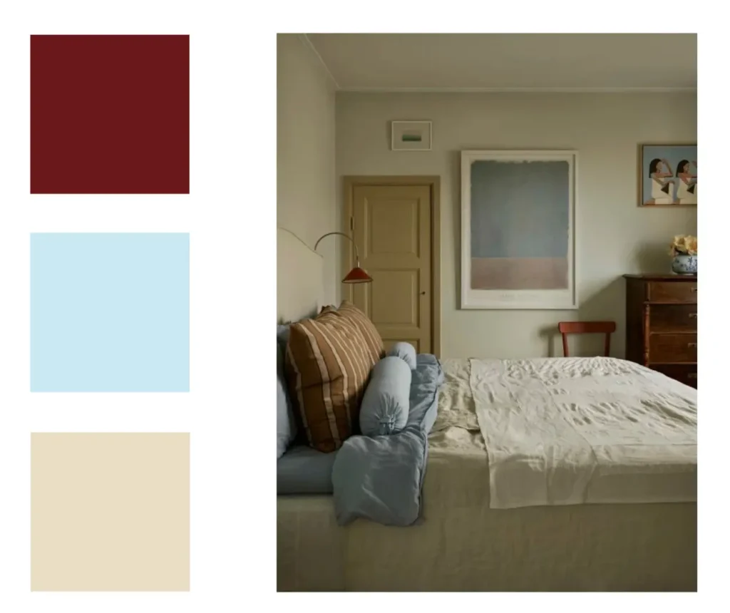
Step 3: Review Your Paint Colors
Now it’s time to review your narrowed down paint selections.
Start by gathering a variety of paint swatches and bringing them into the space. This helps you see how the colors interact with one another and with existing elements in the room. At this stage, you’ll start to notice undertones more clearly and get a better sense of how your overall color combination is coming together.
That said, I never rely on swatches alone. Paint colors can look very different once they’re on the wall due to factors like lighting and surrounding materials. So testing is essential.
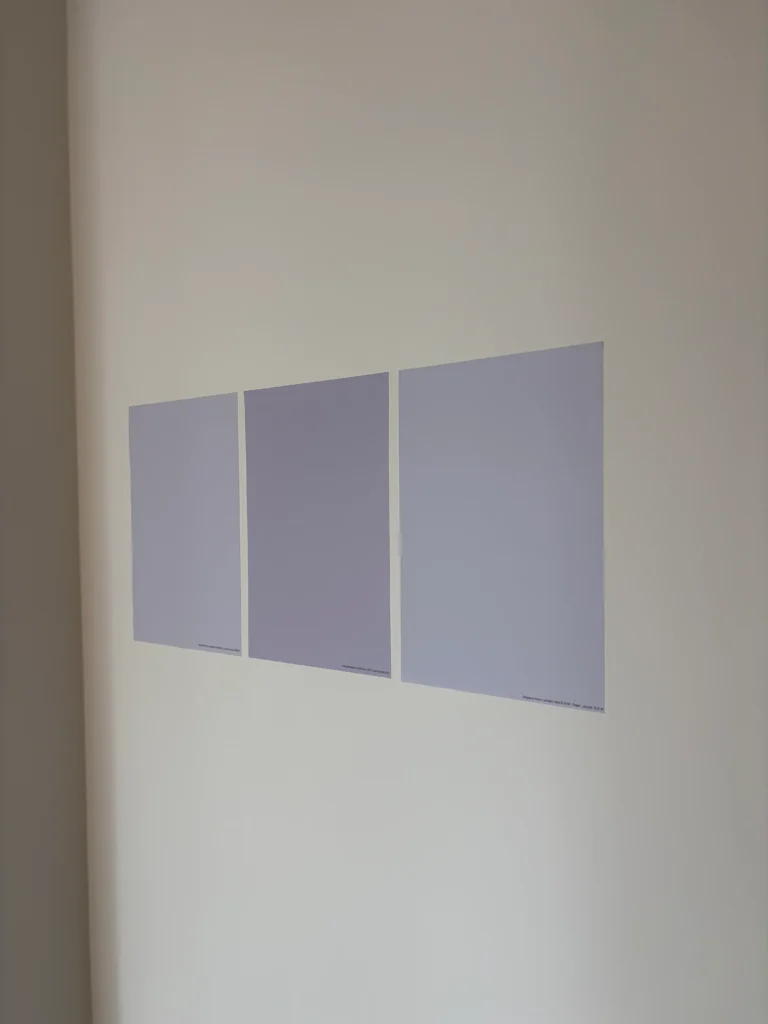
Ideally, you’ll narrow your options down to 3–4 promising colors. From there, it’s time to test them more thoroughly using one of these two methods:
- The traditional method: Purchase sample pots and paint swatches directly onto your walls in different areas of the room. Observe them over a few days, paying attention to how they look in both natural and artificial lighting.
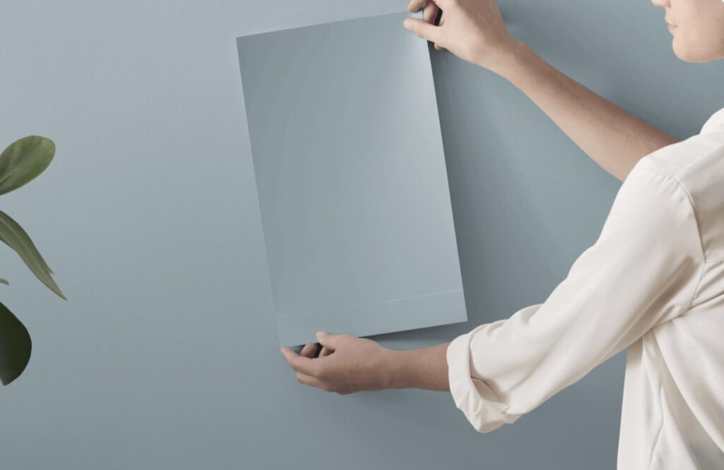
- The modern method: Use large-scale peel-and-stick samples (like those from Samplize). These allow you to see the color on your wall without committing to paint, and you can easily move them around the space. This has become my go-to method—it’s cleaner, more convenient, and incredibly effective.
Testing paint colors takes a bit more effort, but it’s the step that ensures you land on the right color with confidence.
Step 4: Determine Your Paint Finish
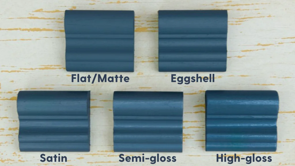
Paint comes in a variety of finishes, and each one is suited to different areas of the home depending on durability, cleanability, and the look you’re going for.
Here’s a breakdown of common paint finishes and where I typically use them:
Flat (Matte) Finish:
Flat is the least reflective finish and provides excellent depth of color. It’s great for hiding surface imperfections on walls.
Where I use it: Primarily on ceilings, since they don’t get much wear and I usually don’t want light reflecting off them (with a few exceptions depending on the design).
Eggshell Finish:
Eggshell has a slight sheen—more reflective than flat—but still does a good job of minimizing imperfections while offering a bit more durability.
Where I use it: Bedrooms, living rooms, and dining spaces. It’s ideal for areas that don’t see a lot of traffic or require frequent cleaning.
Satin (or Pearl) Finish:
Satin has a soft sheen and is more durable, making it better suited for high-traffic areas that need to be wiped down regularly.
Where I use it: Hallways, powder rooms, bathrooms, and sometimes for accent walls.
Semi-Gloss Finish:
Semi-gloss is noticeably more reflective and highly durable. It’s resistant to moisture and easy to clean.
Where I use it: Trim, doors, baseboards, and cabinetry—anywhere that needs durability and a bit of contrast against the walls.
Tips and Tricks To Getting Your Paint Color Right
There’s nothing worse than painting a room, only to realize the color doesn’t match what you saw on the paint chip in-store. The reality is, color behaves differently depending on lighting and the surrounding elements in a space.
That’s why it’s so important to consider both color theory and lighting when selecting a paint color. The most reliable way to ensure your color turns out as expected is to review and test it directly in your space with paint samples or swatches.
Thankfully, it’s easier than ever to do this. My go-to method is ordering large-scale peel-and-stick samples (from Samplize) and placing them on the walls. This allows you to observe how the color looks throughout the day as lighting conditions shift—whether it’s morning light, evening shadows, or artificial lighting.
And there you have it, my four steps to confidently choosing a paint color with no regrets and no surprises.
To read more about paint colors, see:
The Best Paint Color Ideas For Small Spaces
10 Paint Colors Better Than Benjamin Moore Swiss Coffee
Metamerism: Why Your Paint Colour Didn’t Turn Out as Expected
Click Here To Shop My Favourite Home Goods
Let’s design your space together, virtually.