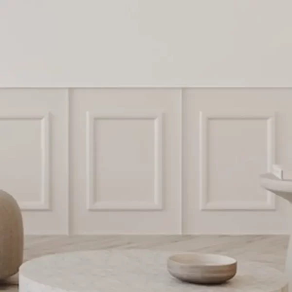
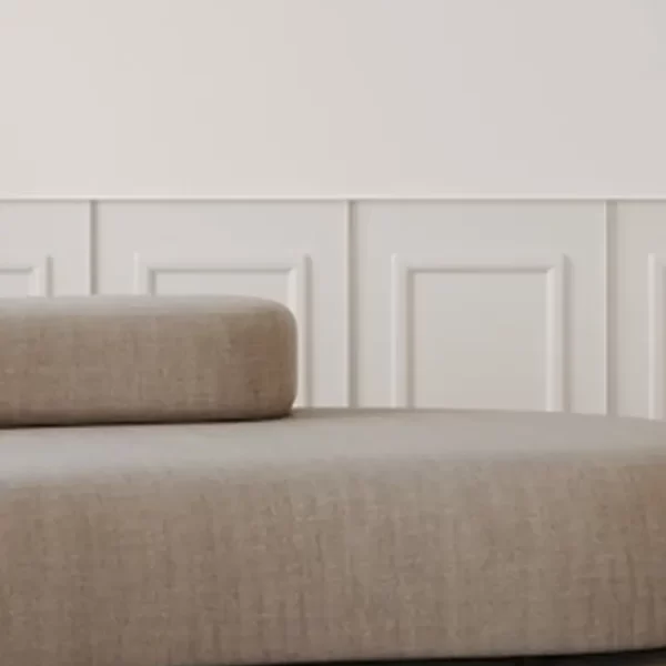
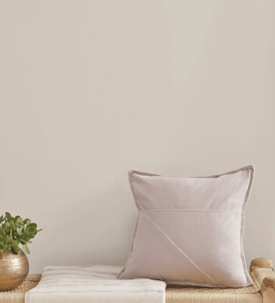
In this post, I have another paint color (or colour) list featuring my favourite shades to consider for your home. In this post, I’m rounding up my favourite warm gray (or grey… can’t American and UK English agree…?!) paint colors, since it’s such a popular choice for so many spaces — and honestly, gray can be really tricky to get right. So, I thought this list might help you narrow down the options for your next painting project. Let’s get into it!

AVOID COSTLY (AND UGLY) DESIGN MISTAKES

Is Gray Considered Outdated in Interior Design?

You might have noticed that current interior design trends have moved away from gray, which may make it seem like gray is “out” or outdated. And well… I’d say that cool-toned grays are somewhat outdated, yes.
That said, this doesn’t mean you can’t use them — you definitely don’t have to follow every trend. In fact, I always encourage people to design spaces around what they love, not what’s trending.
However, if you are concerned about your space feeling current, warm grays are still very much in — and honestly, I think they’re more timeless in compared to cool-toned greys. Warm gray brings more depth and, well, warmth, making it easier to coordinate with other colors and materials.
So, perhaps that’s why you’re drawn to painting your space in this hue — or at least considering it. Either way, I’ve put together a list of my top warm gray paint colors to inspire your next project.
And if you want to make the paint selection process easier, check out Samplize, where you can order paint swatch samples that stick right to your wall — no messy paint cans required!
The Top 10 Warm Gray Paint Colors
1. Sherwin-Williams Accessible Beige

SW Accessible Beige is officially listed as a beige, but in some spaces, it can read quite gray. It’s an incredibly versatile shade that I’ve used in countless projects, and it seems to adapt seamlessly to different spaces. So, is it gray? Maybe — or perhaps more accurately, a greige. Either way, it’s definitely one to consider, especially if you’re looking for a neutral backdrop that’s practically a no-brainer.
2. Sherwin-Williams Eider White

Here’s another Sherwin Williams gray shade I love: Eider White. This one has just enough pigment to balance between a true white and a light gray. It’s a great option for dim spaces with limited natural light, where you still want a bright, airy feel. It adds a touch of warmth without making the room feel dark!
3. Sherwin-Williams Aesthetic White

Sherwin-Williams Aesthetic White is another shade I use often. It’s slightly lighter than its “sister,” Accessible Beige, making it probably the lightest color I’ve included here (along with Eider White). Yet, it still has enough pigment to lean gray, depending on the lighting and space of course. I love this color in spaces with bright white trim when you want a subtle contrast on the walls without going too dark. Its truly neutral undertones make it incredibly versatile — it works just about anywhere.
4. Benjamin Moore Pale Oak
Benjamin Moore Pale Oak leans a bit more toward taupe, but it still makes the list because it can read gray in certain spaces. It strikes a great balance of warmth and pigment, making it an ideal “in-between” color — not quite white, not quite gray. If you’re looking for a versatile, neutral shade, this is definitely one to consider.
5. Sherwin-Williams Worldly Gray
Sherwin-Williams Worldly Gray is a very classic and traditional warm gray. If you’re looking for a warm tone for a more traditional or transitional space, this is a great shade to consider. It’s cozy, inviting, and adds a welcoming touch to any room.
6. Benjamin Moore Balboa Mist

Benjamin Moore Balboa Mist is a versatile warm gray with a unique undertone — personally, I notice a hint of green, which I actually love. It pairs beautifully with wood tones and earthy spaces. This is a classic shade that people will continue to gravitate toward, so definitely grab a sample and test it in your space.
7. Benjamin Moore Revere Pewter

Benjamin Moore Revere Pewter is another deeper warm gray, similar to Sherwin-Williams Worldly Gray. Its undertones lean to warm brown, but in bright light, it can appear more gray. I find this shade can be a bit of a chameleon, adapting beautifully to different spaces. Nonetheless, it’s still a classic that stands the test of time.
8. Benjamin Moore Pashmina

Benjamin Moore Pashmina is another chameleon-like shade — in some interiors it reads brown, in others gray. It makes the list because it’s gorgeous and rich. If you’re looking for a more saturated color, this stunning shade is definitely one to consider.
9. Benjamin Moore Nimbus
Benjamin Moore Nimbus is a very soft shade with a contemporary feel. It’s light, yet still has a nice depth, making it a great contrast to both white and deeper colors. This is a unique warm gray worth considering.
10. Benjamin Moore Collingwood

Benjamin Moore Collingwood is another unique warm gray, one I like to call a “gentle” warm gray. It’s light, soft, and easy on the eyes. It can have a subtle violet undertone, but don’t worry — your walls won’t look purple unless there are a lot of greens or yellows nearby. Remember, color theory matters: other colors in the space can impact how your wall paint reads, so always test a sample before committing.
Select Up-To Date Warm Gray Paint
So, there’s my list of what I would call the 10 best warm gray paint colors to consider for your home. These shades won’t give you an outdated look — instead, they bring warmth and style that are currently on trend, creating an inviting and comfortable space.
Gray can be a tricky color, and honestly, it’s often one I don’t gravitate toward. As a designer, I lived through the 2015 era when everyone wanted cool-toned gray everywhere, including flooring. After a while, I grew tired of it. However, I’ve really warmed up to warm gray (no pun intended) and actually plan on using it in my own home!
So, if you were looking for a designer’s take on warm gray, now you have it.
Also, read: 10 Paint Colors Better Than Benjamin Moore Swiss Coffee
and
Read: Metamerism: Why Your Paint Colour Didn’t Turn Out as Expected
Click Here To Shop My Favourite Home Goods
Let’s design your space together, virtually.